How to Choose an ERP UX Design Agency
ERP software runs purchasing, inventory, sales, finance and production on shared data and transactions. This article explains how to choose an ERP UX design agency. It covers what ERP experience changes in a design project, how to read an agency’s portfolio, and which questions help verify expertise before work begins.
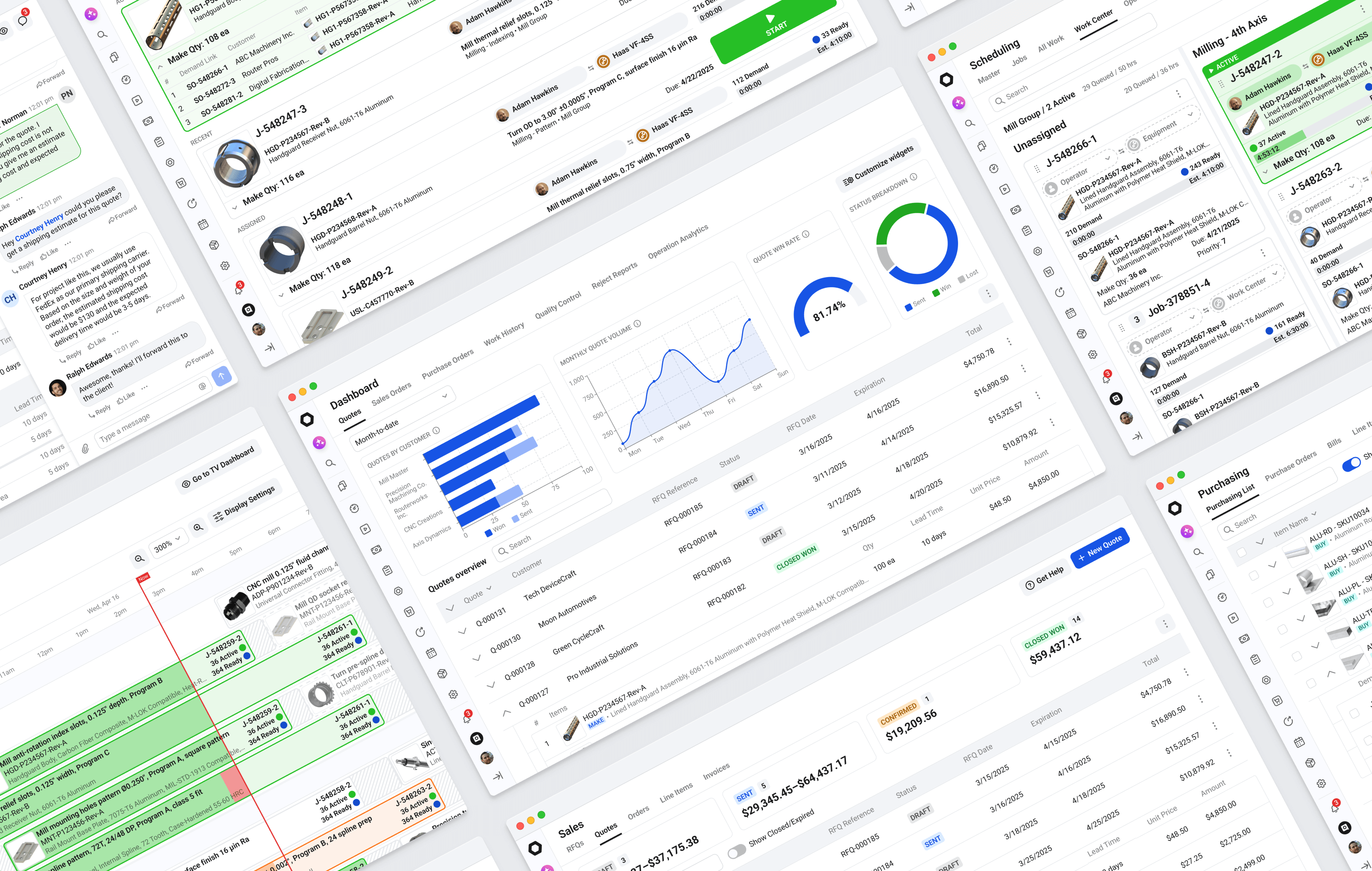
Open a purchase order in almost any ERP and some fields look like duplicates. The requested date sits next to the promised date, the vendor item number next to the internal one, the purchase unit next to the stock unit. Buyers rely on every one of them.
A team already familiar with ERP transactions and workflows can spend more of discovery on the specifics of your product. A team new to the domain has to spend part of that time building the ERP context first.
That is why choosing an ERP UX design agency takes different criteria than choosing a partner for a typical SaaS product.
Key takeaways
- An ERP UX design agency should understand transactions, configuration settings and exceptions before it starts designing.
- Fields and dense screens that look redundant often support daily decisions, so a good agency audits them before removing anything.
- ERP workflows cross modules and roles, so changing one screen can affect receiving, inventory, invoicing or reporting elsewhere.
- The decisions that matter most in ERP rarely show in a portfolio screenshot, so case studies with operational context tell you more.
- Questions about workflows, legacy screens and implementation, plus a short written scenario, help verify expertise before the project starts.
Why ERP screens look redundant
Each of the purchase order fields from the introduction supports a decision. The gap between requested and promised dates shows which orders are late, and the vendor item number is what the supplier confirms against. When goods are bought by the case of twelve and stocked by the piece, the unit conversion sets both the receiving count and the unit cost.
The same system often has the opposite problem elsewhere. A warehouse transfer document may carry dozens of fields, while the people moving stock need items, quantities and two locations.
Deciding which fields stay and which go is a large part of ERP UI/UX design. An ERP UX design agency handles it with a field audit. This is a table that lists each field, the role that uses it, the decision that depends on it, and whether it stays, moves to secondary detail or goes. Ask how the agency runs this audit and what the output looks like.
We look at every field through the step it serves in the process. If a field does not help the user complete the current step, it usually belongs in secondary detail.
How ERP differs from a typical SaaS product
Many SaaS products, including B2B ones, have trained power users, approvals and complex workflows. ERP adds transactions that connect documents across modules and settings that change how those transactions behave. The table shows typical differences in emphasis.
| Area | Typical SaaS | ERP |
|---|---|---|
| Product emphasis | Often onboarding, adoption and time to value | Accurate, repeated execution of operational work |
| Typical interaction | Tasks and projects inside one workspace | Transactions that connect orders, receipts, inventory and invoices |
| Configuration | Usually account and feature settings | Rules that change how transactions behave, such as costing or partial receiving |
| Effect of an error | Typically workflow friction or a data correction | Can affect stock levels, costs, accounting and traceability |
ERP also has a configuration layer. During setup, a company may configure inventory valuation and costing methods, such as weighted average or standard cost. It also defines how partial receiving, shipping and invoicing work, whether bills can be consolidated, how lots and serial numbers are tracked, and what the audit trail records.
These settings change what a screen shows and which actions it allows, so two customers of the same product can need different behavior from the same form. Agencies with ERP experience document these screen states, often in a configuration matrix that shows how one form changes when a setting changes, for example when partial receiving is turned off. The document may have a different name, and the agency should be able to explain how it records screen states and rules that depend on configuration.
Start with the workflow behind the screen
ERP modules share data, statuses and fields across related records. A change to quantity or status on an order line can surface in inventory, shipping, invoicing and reporting, so we map what a document triggers before changing its layout.
Two chains run through a typical ERP.
- Procure-to-pay. Purchase Order → Receipt → Inventory → Vendor Bill → Payment
- Order-to-cash. Sales Order → Allocation → Shipment → Invoice → Payment
Production and quality sit between these chains in a manufacturing company. In a distribution business, the warehouse does.
Mapping the chain also shows shorter paths that no single screen reveals. Replenishment suggestions based on demand and minimum stock levels, filtered by vendor, item and date, let a buyer work through one list without checking stock item by item. Designing that list requires understanding demand, inventory and purchasing together.
The working document here is a process map. It follows one document, such as a purchase order, through every module and role that touches it, from the person who creates it to the people who change, approve and review it later. When you describe one of your screens, a team used to this method will ask about that path before it discusses layout.
Data density in ERP interfaces
Some ERP screens stay dense because users compare values across rows and columns to make a decision. Sales and purchase orders by line item, quotes with a cost breakdown, item master tables and margin analysis belong here. Splitting them into tabs and drawers makes users rebuild the same context again and again.
In audits we also find large tables added in case someone might need them, which nobody uses for any decision.
Mobile screens for warehouse and field users need a different structure. A person receiving goods works through one focused step at a time, such as scan, count, photograph damage and confirm.
Across these cases, values compared together stay on one row or one screen, secondary detail moves to panels or saved views, exceptions are visually distinct from normal states, and actions sit next to the information needed to take them.
Data tables show this skill better than any other screen type. In a portfolio, look for tables with realistic volume, with dozens of rows, documents in different statuses, filters, bulk actions and at least one exception, such as a line on hold. Five tidy rows in a single status show visual style and little else.
Where ERP design projects lose time
The first source of lost time is domain ramp-up. An agency new to ERP learns transactions, costing methods, partial receipts and configuration during discovery, and those hours become part of the project scope.
The second is the rebuild reflex. A legacy ERP with years of accumulated screens looks like a candidate for starting over. In audits we regularly reach a moment when the product team asks whether a screen was built before, who remembers what it does, and when it appeared. The people who wrote its logic have often left the company.
Much of that logic handles exceptions. A partial receipt makes inventory available while the purchase order stays open. Items sent to an outside service have to stay tracked until they return. A split lot must keep its traceability, and one consolidated bill can cover several receipts. When an ERP redesign removes these rules together with the old interface, the business still needs them, and users rebuild them in spreadsheets and manual steps.
Removing a screen or field people rely on always slows down the routine flow. Thousands of small extra actions add up to many hours.
Backend logic adds a third constraint. Some of it cannot change yet, so we design for the system as it is and restructure it gradually, with product leadership and engineers agreeing on each step. When a concept depends on backend work that has not started, or its demand is uncertain, we build a clickable prototype that product leadership can show to customers before engineering commits.
An agency prepared for legacy work keeps a rule log during the audit, listing each business rule it finds, the screen that carries it and the people who rely on it. Ask how it builds that log, and ask for an example where a backend constraint changed its design.
What ERP experience changes in a design project
| Area | With ERP experience | Risk without it |
|---|---|---|
| Domain knowledge | Starts with working knowledge of common ERP transactions and exceptions | Discovery time goes into learning basic ERP terms |
| Legacy screens | Documents business rules before changing screens | Rules can disappear together with old screens |
| Dense screens | Organizes data around the decisions users make | Data people compare can end up split across tabs |
| Users | Maps the roles that work with each document | Screens can end up designed around one persona |
| Configuration | Designs screen behavior for different settings | Screens can work for one setup and break for another |
| Technical constraints | Raises data and performance questions during design | Constraints can surface late, during development |
| After handoff | Can support implementation and resolve edge cases with developers | Developers may resolve open questions without design input |
How to read the portfolio of an ERP UX design agency
Portfolios are built to be looked at, and that works against ERP work. The decisions that matter most rarely show in a screenshot, such as which fields on an order screen buyers actually read and why the others stay. A dense, plain-looking screen built by a team that understood the process can look weaker in a case study than a clean screen built by a team that did not.
Agencies that work mainly on consumer-facing and horizontal B2B SaaS build their portfolios for that market. Typical signs include the following.
- A mixed project list with branding, landing pages, concept micro-SaaS, mobile HR apps, crypto wallets, fintech dashboards and several task or project management tools.
- Presentation-style screens with gradients, illustrations, large hero charts and a few rows of ideal data.
- Case studies that describe research, wireframes and a UI kit, with no roles, transactions, exceptions or configuration.
- ERP listed as a service without an ERP case to support it.
Without an architectural view and a rough understanding of how production, accounting, warehouse, purchasing and sales work, ERP design ends up looking like Dribbble shots, lightweight HR SaaS or consumer fintech.
A useful case study from an ERP UX design agency shows tables with realistic data, documents in different statuses such as draft, partially received, on hold and closed, and several roles working with the same document. It describes at least one exception the design had to handle, the length of the engagement and what happened during implementation.
Independent reviews and multi-year work on one product add evidence beyond the portfolio. On Clutch, you can read StartProto’s review of our manufacturing ERP redesign and OnBatch’s review of our batch-processing ERP design.
Redbrix ERP case studies.
- StartProto, manufacturing ERP for job shops and contract manufacturers
- OnBatch (now Beverage360), batch-processing ERP for beverage manufacturing, including distilleries, breweries and wineries
Questions that verify the expertise of an ERP UX design agency
These questions work in an RFP, a proposal review or written correspondence, before the project starts.
- Which ERP modules have you designed, and how long did each engagement last? Expect named modules, such as purchasing, inventory, invoicing and costing, with engagement length and links to cases.
- How do you run a field audit and map a document’s path through the system? The agency should describe the output in concrete terms, including the columns in the audit table, the roles on the map and how findings turn into design priorities.
- How would one of our screens behave under two costing or inventory methods? Look for conditional states, configuration and role permissions in the answer.
- What happens to a legacy screen whose logic nobody on our team can explain? The first step should be documenting its rules through observation and interviews.
- How are you involved during implementation? Two working models are common, an embedded product design team or a defined phase followed by support for developer questions and edge cases.
Answers in conversations and correspondence also show experience.
- Who they name. An experienced team describes users in sequence, for example the buyer who creates an order, the manager who approves it and the accountant who checks it later.
- How technical limits are handled. If a proposal assumes live recalculation across modules or unrestricted filtering across large datasets without discussing data availability or performance, ask how those interactions would be supported technically.
- How they talk about their own mistakes. An agency that has done this work can name a specific operational misunderstanding from a past project and describe what it changed.
A short written scenario adds a practical check. Describe a case where the supplier’s invoice does not match the purchase order and the delivery, with a different quantity and a higher price. Accountants call this a three-way match problem, and Microsoft’s documentation for Dynamics 365 Finance shows how one ERP handles it with matching policies and price tolerances. Ask the agency how it would design this exception in the interface.
An answer grounded in ERP experience covers who resolves the difference, what tolerance applies, what happens to inventory value and whether payment waits until someone approves it.
Conclusion
Choosing an ERP UX design agency comes down to evidence of work with transactions, configuration and exceptions. Case studies with operational context, working methods the agency can explain, and its answers to a concrete scenario show that evidence before any contract is signed.
Redbrix is a product design studio for B2B software such as ERP, MES, MRP, QMS, WMS and inventory systems, compliance platforms, enterprise process tools and AI-powered products. Our team has worked on ERP, MES and MRP products for more than ten years. If you are comparing ERP UX design agencies, the questions in this article apply to us as well.
FAQ
It designs the workflows and interfaces of business software that runs purchasing, inventory, sales, warehouse, finance and, where relevant, production and quality. The work includes UX audits, process mapping, information architecture, role and permission design, interaction design, prototyping, design systems and support during implementation.
ERP UX puts more emphasis on repeated operational work, connected transactions, configuration and exception handling. SaaS products can also have complex workflows and trained users, but ERP actions are more often tied to inventory, costing, accounting or traceability across modules.
An ERP UX audit reviews how users complete key workflows and documents the findings. It usually includes a field audit for the most-used screens, maps of how documents move between modules and roles, a log of business rules found in legacy screens, and a list of problems ranked by workflow. The result shows what to redesign first and what has to stay.
For lightweight business tools with simple flows, yes. For a mature ERP, the agency learns transactions, exceptions and configuration rules during the project, and that learning becomes part of the timeline and budget.
Platform experience matters when the work is constrained by SAP, Microsoft Dynamics, NetSuite or another established architecture. For a custom ERP or vertical SaaS product, experience with comparable workflows matters most, such as procure-to-pay, order-to-cash, inventory, costing and permissions.
The decision follows an audit of existing workflows and exceptions. A redesign fits when core workflows remain valid and navigation, hierarchy and interaction patterns need work. A rebuild becomes an engineering decision when the architecture blocks future requirements.
The existing interface already contains business rules your developers implemented, and the first phase should document them before visual work begins. Look for an agency that starts by asking which screens your team uses most and which it avoids.
Split each task into focused steps, such as scan, count, photograph and confirm, with large touch targets, clear status and minimal navigation. These screens are used on the move and under time pressure.