Brand identity and website design for Mintarius
Mintarius introduces a new category to the precious metals industry: a shared product data platform connecting producers and dealers. Redbrix designed its brand identity and marketing website, giving this new model a clear visual presence grounded in the industry’s materials and built for a digital business.
About client
Mintarius is a German company building a central product data hub for the precious metals industry. Mints and refineries publish their catalogues once, giving dealers in the network standardised access to product images, specifications and descriptions. The platform moves product information beyond static collection catalogues into a shared, continuously updated resource.
Industry
Precious metals / B2B product data platform
Services we provided
– Brand identity design
– Logo design
– Visual identity system
– Brand guidelines
– Web design
– Design system
– Logo design
– Visual identity system
– Brand guidelines
– Web design
– Design system
Challenge
The precious metals industry’s visual language centres on physical objects, printed catalogues and the weight of the materials themselves. Mintarius needed to introduce a shared, continuously updated model for product data within that familiar setting. The challenge was to make the brand recognisable to producers and dealers while giving the marketing website a clear way to explain this new model.
Solution
We connected the industry’s material heritage with the clarity of a digital business. A mark derived from coin geometry provides the link to precious metals; black and restrained gold carry that reference into the palette. Clean sans-serif typography gives the identity a technical character and a clear hierarchy for presenting information.
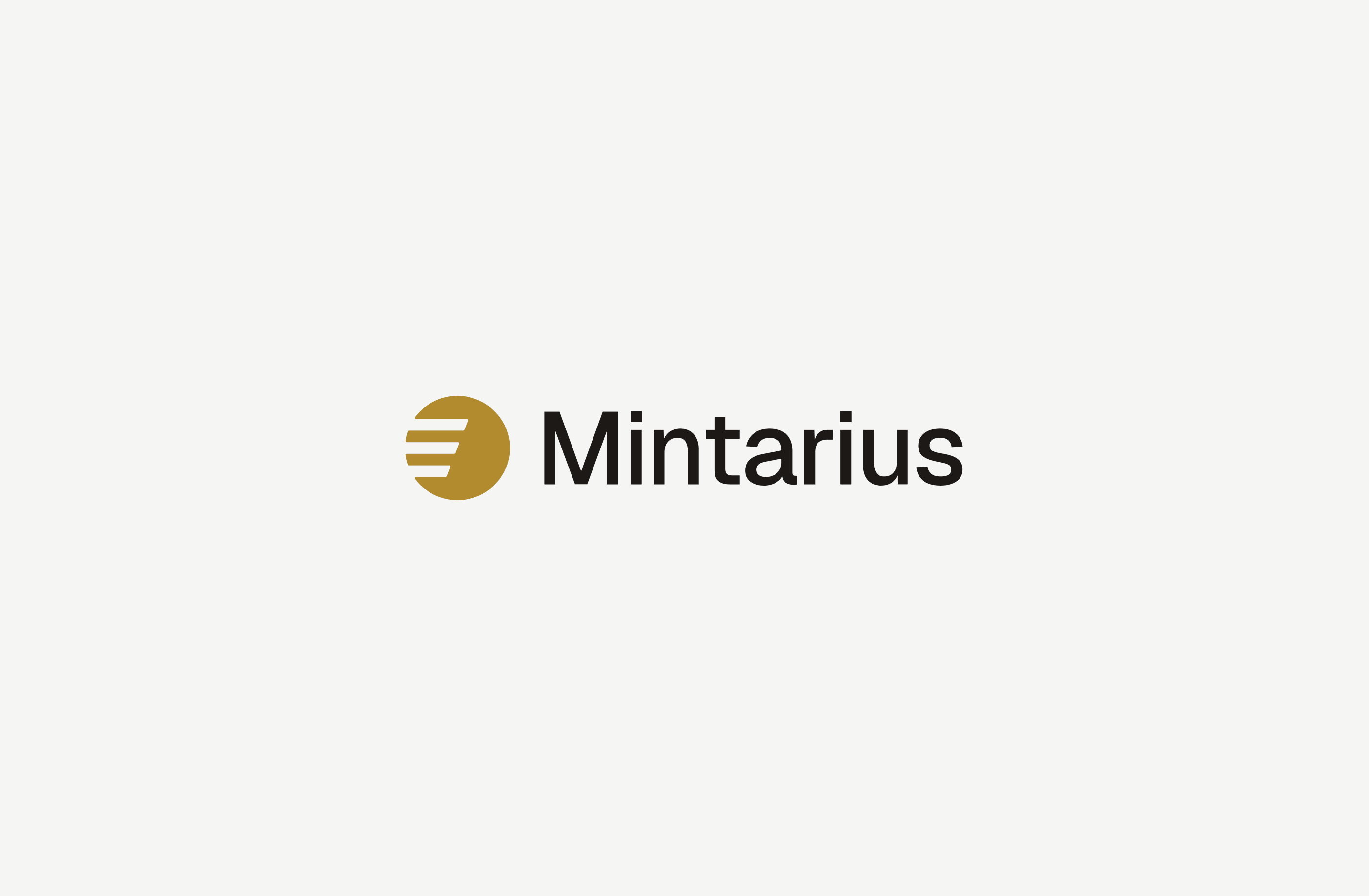
Brand identity and visual system
The mark reduces the circular geometry of a coin to a precise, modular symbol. Defined proportions keep its construction consistent as it changes scale. The wordmark uses a restrained sans-serif with a slight technical edge, while black and gold provide the core colour pairing. Light and dark versions show how the mark and wordmark adapt to different backgrounds.
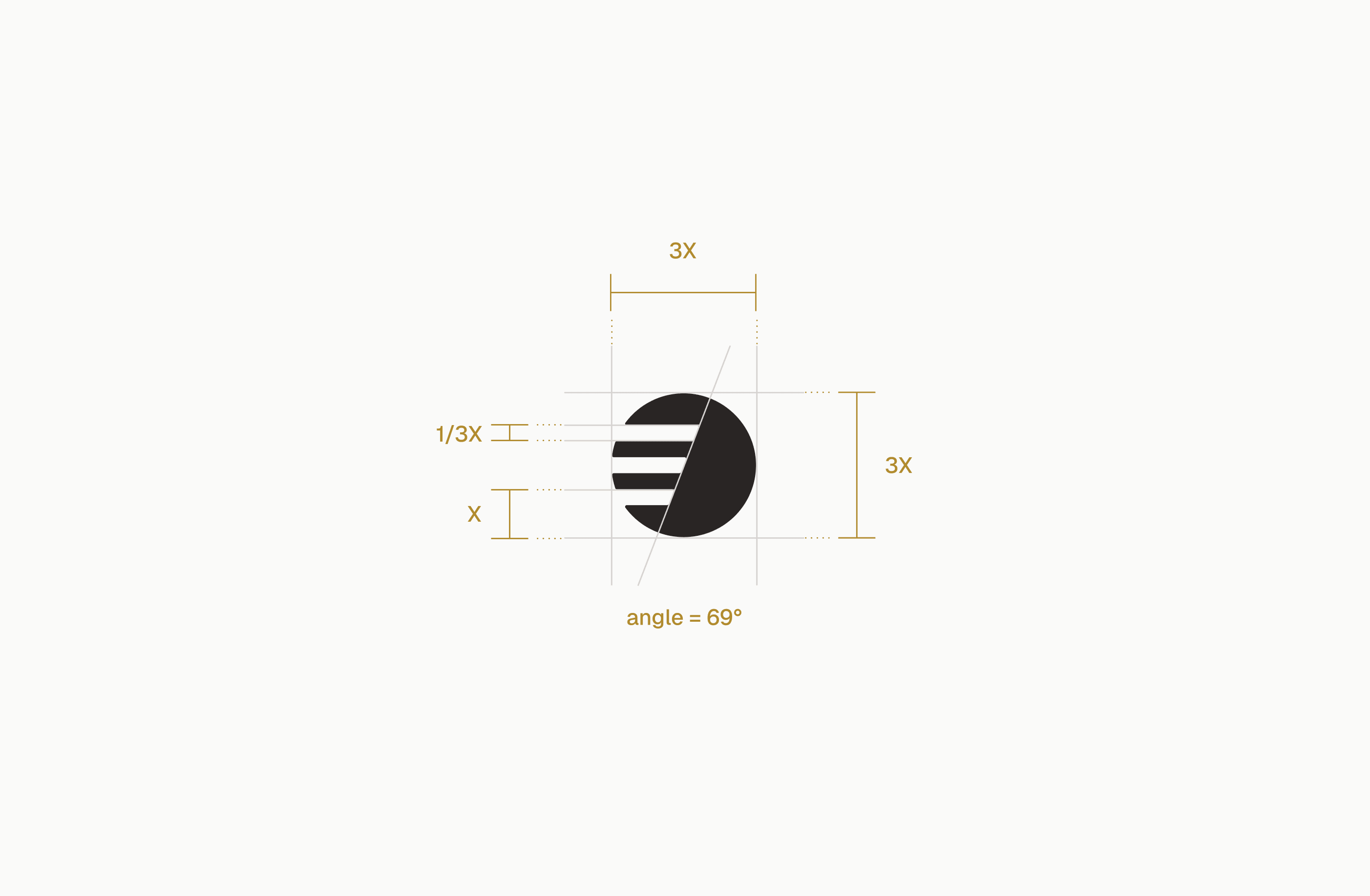


Brand guidelines for a scalable system
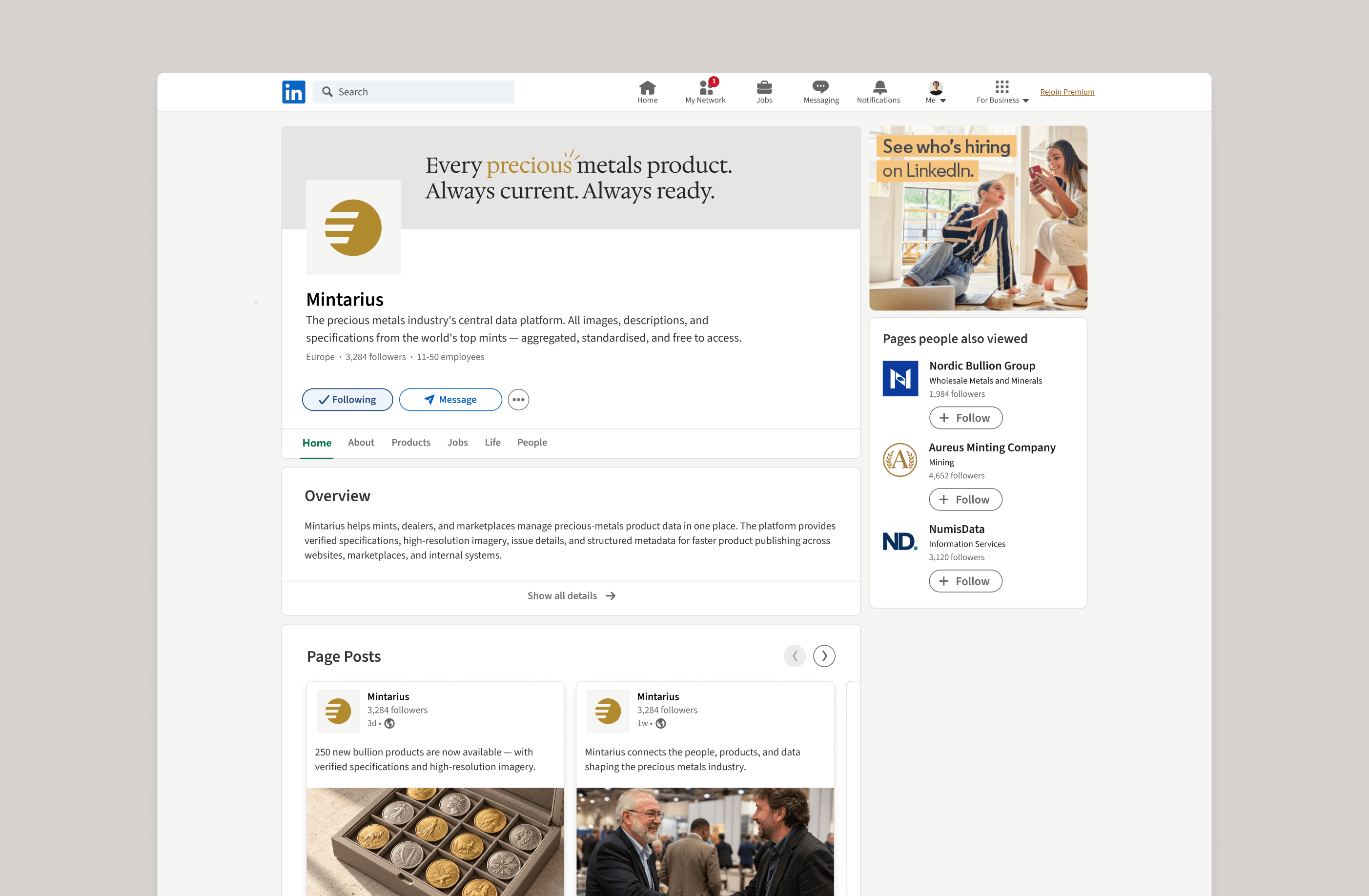
The identity was delivered with brand guidelines defining colour values, the typography scale, spacing rules and the logo’s clear space. These rules give designers a consistent basis for using the identity across formats and sizes. The examples below show the brand applied to a LinkedIn page, mobile notifications and an app icon; they illustrate applications of the identity rather than pages from the guidelines document.


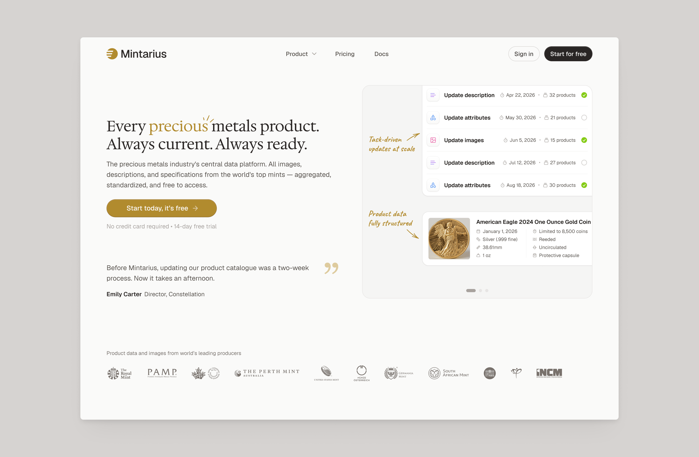
Website design for producers and dealers
The marketing website introduces Mintarius through its own product screens. The homepage pairs an overview of the platform with examples of the information producers publish and dealers receive. Headings, supporting copy and screen imagery create a content hierarchy that explains the shared data model while keeping the product visible.
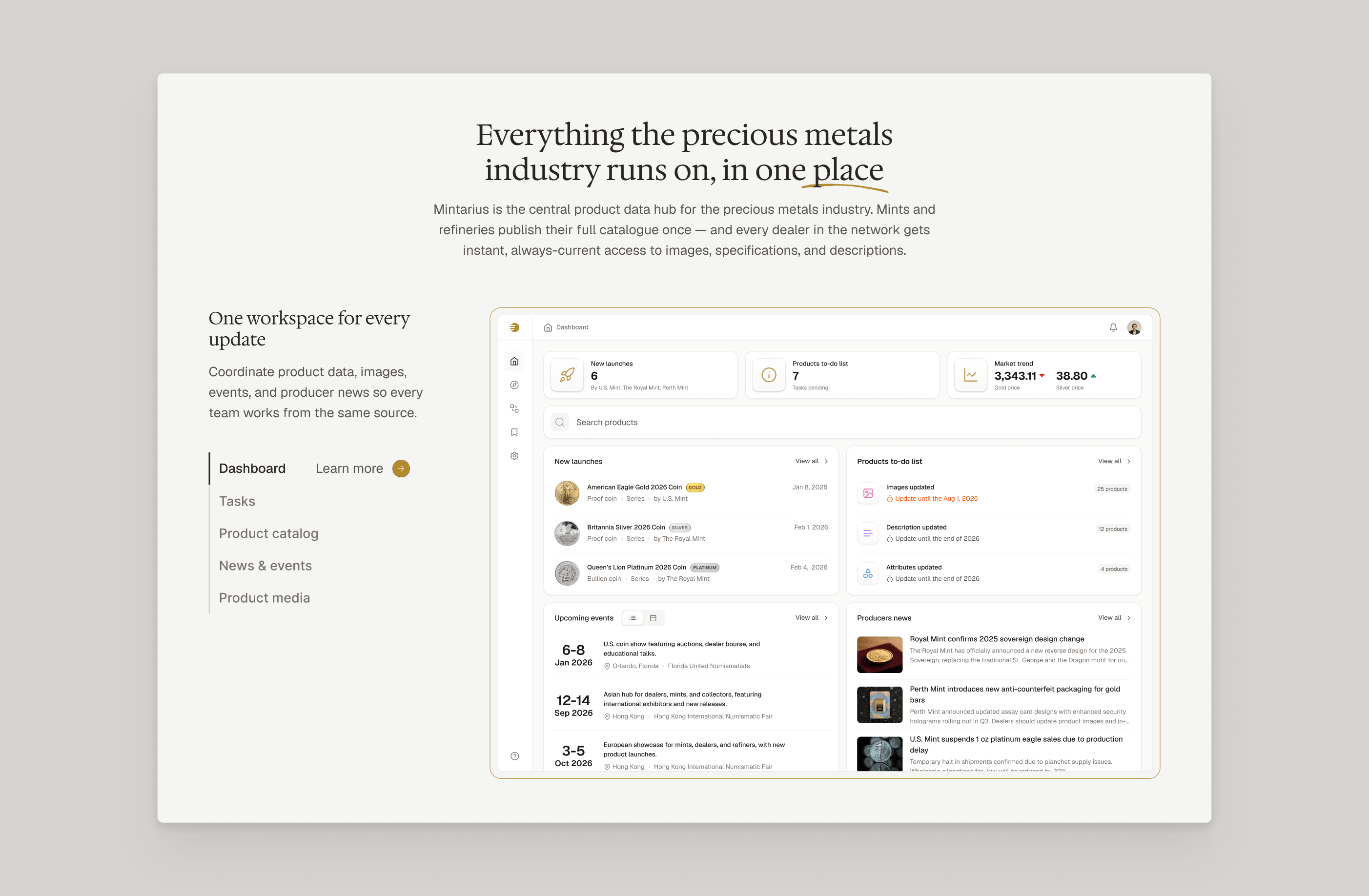
Presenting complex product data on the website
Product specifications, imagery and producer information give the website concrete material to work with. Feature sections and product detail examples organise this information into readable groups, using typography and spacing to distinguish explanations from screen content. The platform interface appears here as an application of the visual identity; its workflows are covered in the separate product design case.
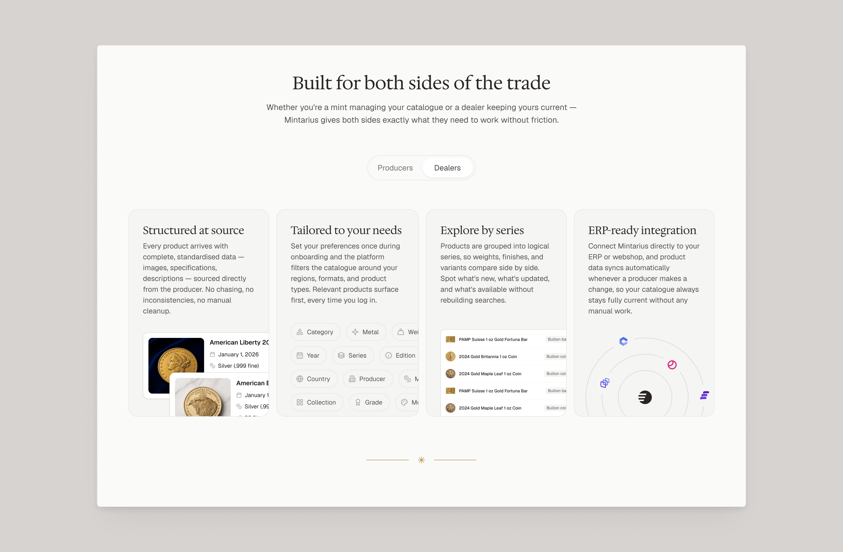
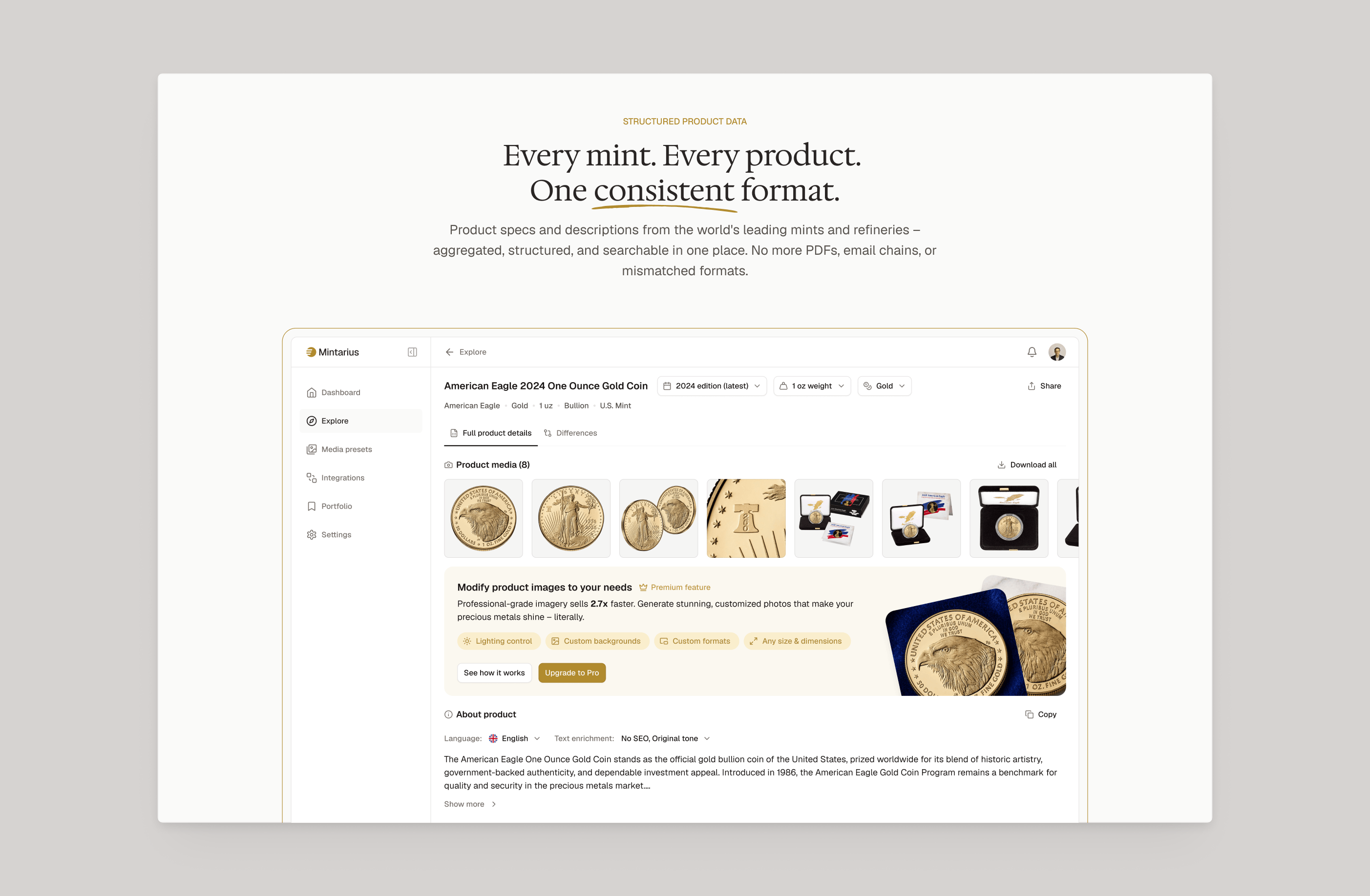
Consistent branding across website pages
The website carries the same grid, palette and typography from the homepage through product information and pricing pages. Repeated heading styles, spacing and image treatments keep the pages visually connected while allowing each to present different content. The logo and colour applications maintain the brand’s character throughout.

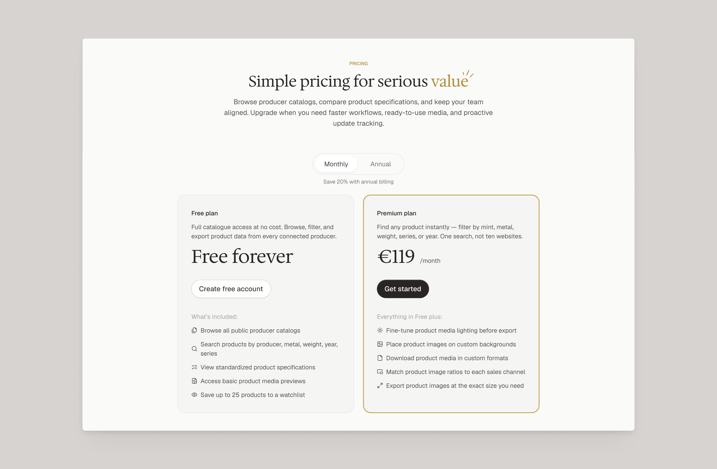
Outcome & Impact
Redbrix delivered the logo, visual identity system, brand guidelines and marketing website design for Mintarius. Coin geometry, black and gold, and a defined typography scale give the company a recognisable visual language for introducing its shared product data model.
The materials shown in this case demonstrate how the identity works across light and dark backgrounds, social media, mobile touchpoints and website pages. Consistent proportions, spacing and logo use connect these applications, including the visual treatment of the platform interface.
Mint, refiner, and producer names and logos shown throughout this case study, including but not limited to The Royal Mint, U.S. Mint, Perth Mint, Austrian Mint (Münze Österreich), Royal Canadian Mint, and PAMP Suisse, are trademarks of their respective owners. They appear solely to illustrate the real functionality of the Mintarius platform and do not imply any affiliation with, sponsorship of, or endorsement by these organizations. Product and coin images are shown for illustrative purposes only.